Projects
This portfolio showcases projects I did this semester and each none reflects the skills I've developed from creative design to coding. I'm proud of the progress I've made and am excited to share what I've learned!
Project 1: Front Page
 View PDF
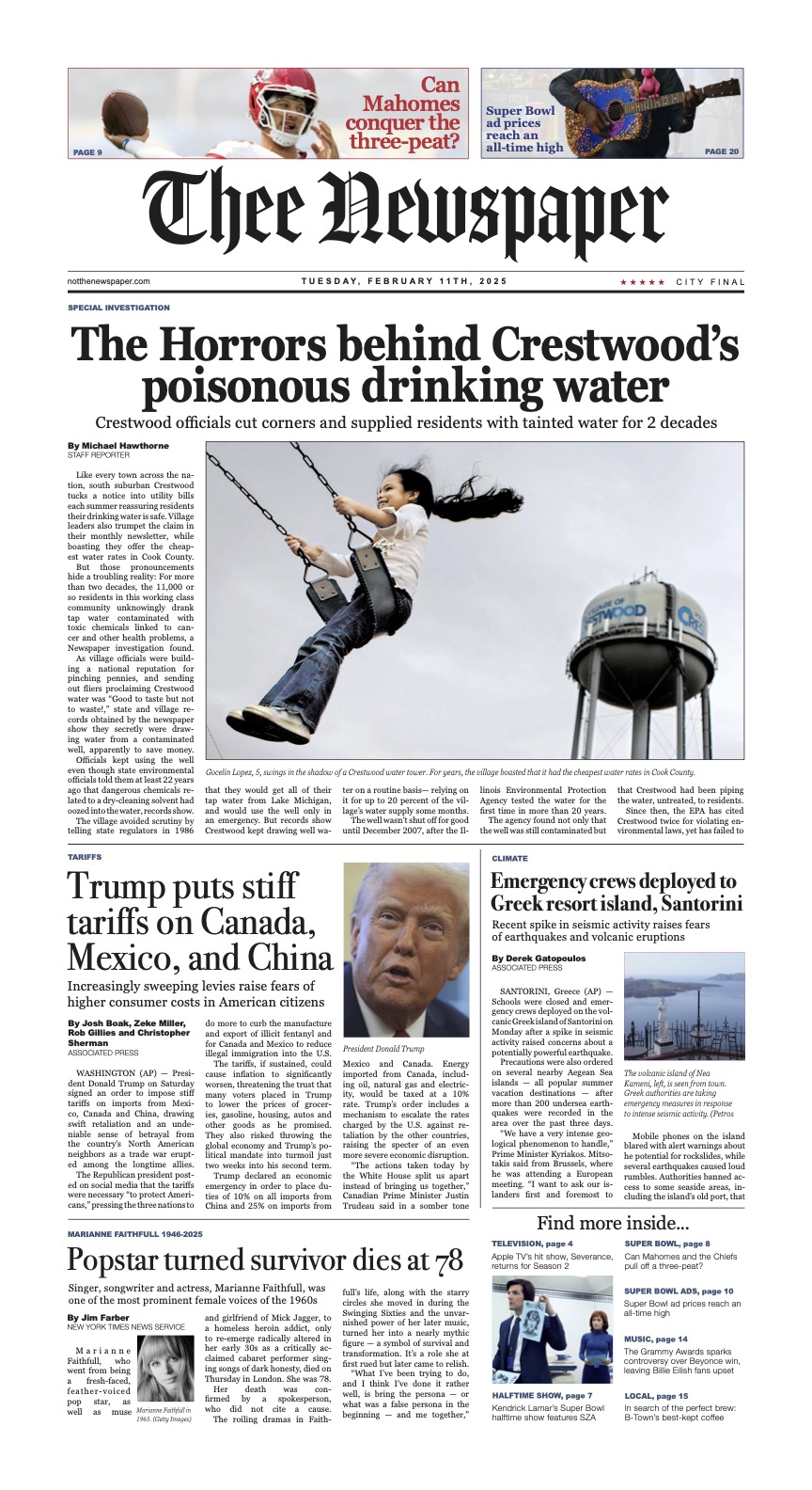
For the first project of the semester me and my partner Anett Vaysberg (mailto:avaysber@iu.edu) created the Front Page Newspaper template. Before this project, our professor taught us all the in’s and out’s of creating a well-designed newspaper and provided us with the tools we needed to be successful. What we learned in class helped to play an important role in the outcome of our project. In the beginning, me and Anett first started to sketch our baseline idea. Nothing too crazy, just creating a standard outline of what we wanted our frontpage to look like. Sketches are so important because they give you the freedom to try many different designs and make the right decision, instead of sticking to just one. Then, over the course of a week or so me and Anett started to develop our project. Anett created the outline of our project then we would go back and forth each adding in different parts of the project into indesign. Anett and I would email the project after finishing one part so the other person could add the next part. This system worked well because we both got the opportunity to work on the project together. We also found time to meet before class to finish the final touches. As well as, working on it in class. Professor Layton provided us with critical information so we could make the fixes we needed to in order for our project to be successful. Whether it would be changing the size of a headline or making fixes to a promo. After making these adjustments, we are all finished. The only thing left we needed to do was create a style guide and upload on this website. I took the time to make the style guide, but unfortunately my computer wouldn’t let me download it. I sent it to Anett for her to download and submit it. The style guide was important so viewers can understand the main themes of our text. Diving into the more traditional aspects of media was really interesting and eye-opening because I learned so much about why and how the front pages of newspapers are designed the way that they are. Learning about traditional media through graphic design was important because it is the foundation of journalism today. It was a pleasure getting to work with [Anett Vaysberg](mailto:avaysber@iu.edu) who made this project so amazing. I love how our project turned out and it is a true testament to our work. Grateful to have these skills that I know now and apply them to future projects.
Project 2: Magazine
 View PDF
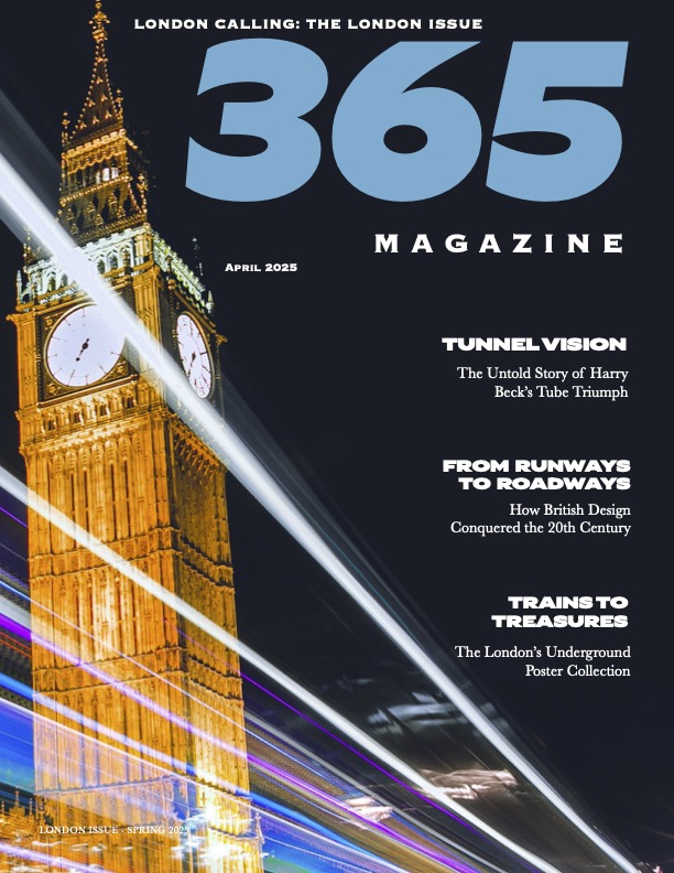
In my graphic design class, I recently had the opportunity to design a magazine for my most recent project. It was creatively fulfilling but also had its challenges. It helped me to expand my skills within InDesign, which was significant because tools I never knew how to use are second nature. Professor Layton helped to provide clear instructions on learning tools in InDesign for this Magazine which led me to be successful. I'm very proud of this project and am excited to share it. The cover was inspired by the picture I had first found. The photo of Big Ben with light streaming in the background played a huge role in the design. I incorporated colors from the light streams into my design, especially the light blue in the "365" title. I picked the lighter blue because it helped to grab the audience's attention since it's so big and bold. I use a futuristic font correlating with the light streams. The futuristic font I continued to use throughout my design all the way to the last page. On the second page, I choose the moving train with red, blue, and white. Continuing the same colors and theme but also making red more of a dominant color. I used light blue in the first part as well to continue the same theme, as well as the same fonts. On the next page from the same spread I used the the train station sign within the theme and had the main story, photos, and a highlighted quote varied throughout the two pages. Then, I incorporated red to the sidebar I chose to do at the bottom. This was beneficial because helped with the design continue to flow by adding the same colors and fonts throughout the whole print. In the alternate story form I wanted to do something different by focusing just on the "icons" of Britain. I used my previous photoshop skills to cut out each icon so I was able to place them all on the ASF page withe icon and their title. I made it simple because I didn't want it to be too overwhelming. This project helped me to grow creatively and continue to improve my skills in InDesign and Photoshop. I'm proud of what I was able to accomplish and thankful for Professor Layton, who played a key role in my success with this project.
Project 3: Poster
 View PDF
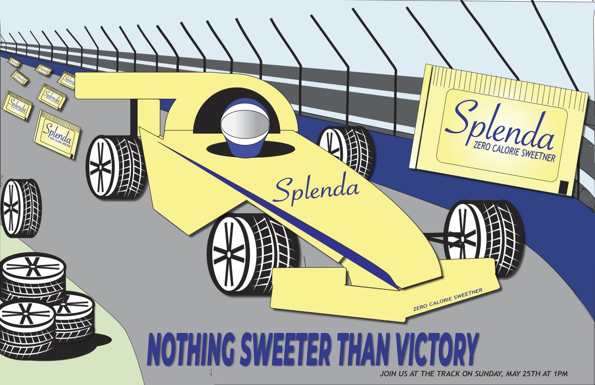
For my recent most project in J-365: Graphic Design, we had the opportunity to create a poster based on a concept of our own choosing, allowing for lots of creative freedom. This open-ended approach made this project extra special because it encouraged us to create our own ideas. With guidance from Professor Layton, who helped us to acquire design skills in Adobe Illustrator, we were then able to apply to our poster project. His instruction helped to provide a strong foundation of skill sets within in Illustrator to help make us successful and turn our creative ideas into visual compistions. This summer I have the opportunity to intern with Splenda working on their healthcare marketing team. Given this experience, I saw it as a valuable opportunity to incoprate the brand into my project. Splenda, along with its partner company Java House, is currently collaborating with Ed Carpterning Racing whose drivers-Alexander Rossi’s (No. 20)and Christian Ramsussen (No. 21)-will represent both brands during the upcoming Indianapolis 500. The Indy 500 is a 500-mile race where 33 drivers battle in the Indianapolis Motor Speedway, reaching speeds up to 220 mph. Widely regarded as one of one the most iconic and adredialne-fueld events in motorsport, the race holds deep cultural significane in Indiana. It has been a longstanding tradition that brings togethers Hoosiers and racing enthusiants from across the country to celebrate the sport’s rich history and competive spirit. My poster embodies these ideals, while also drawing awareness to the Splenda brand. The use of a yellow car serves to immediately attract the viewer’s attention, leveraging color association to enhance brand recognition. The strategic use of angled elements within the compisiton creates a sense of depth and motion, suggesting that the car is moving towards the viewer to increase visual engagement. The color palette-primarly navy blue and yellow-was intentionally selected to maintain consistency with Splenda’s establish brand identity. The placement of the Splenda packet in the foreground draws direct attention to the product, while additional packets functioning as the visual “exhaust” reinforce brand visibility in a creative and symbolic way. The tagline, “Nothing Sweeter Than Victory,” functions as a rhetortical device that links to the sweetness of the product with the concept of success, suggesting that choosing Splenda is the ultimate “victory.” This project served as an opportunity to apply design principles to a real-world brand in a strategic and impactful way. By aligning Splenda’s brand identity and leveraging its current sponsorship of the Indy 500, the poster can function as a creative tool and promotional tool to enhance brand visibility within a culturally significant event.
Project 4: Infographic
 View PDF
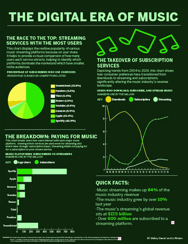
I had the wonderful opportunity to collaborate on an infographic project for Professor Layton’s J365: Graphic Design course alongside Liz Winders. This project allowed us to further develop our skills in Adobe Illustrator while exploring a topic we’re both passionate about: the digital era of music and the impact of streaming on the music industry. Our infographic focused on key aspects such as the rise of streaming services, consumer behavior around paying for music, and the growing dominance of subscription-based platforms. We began by analyzing data in Excel, incorporating streaming statistics into our visual elements. We also sourced outside data from reputable websites to enhance our content. Liz created three primary charts for the infographic, while I focused on the overall layout and visual design. I added supporting elements such as quick facts and illustrative music notes to create a cohesive and engaging final product. Liz also contributed by adding a monochrome theme and refining the text elements to ensure the infographic was consistent. This project was a valuable learning experience in both design and data visualization. Working with Liz was a great experience and eye-opening to see how important precision is when handling data to ensure the final product is both informative and visually compelling.